Mapbox Redesign
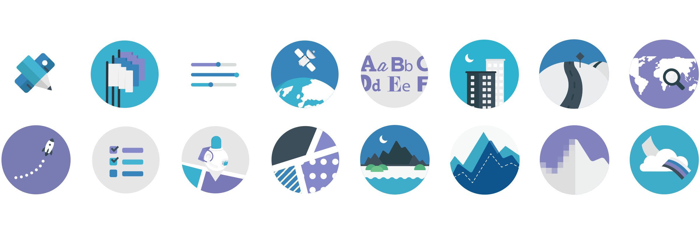
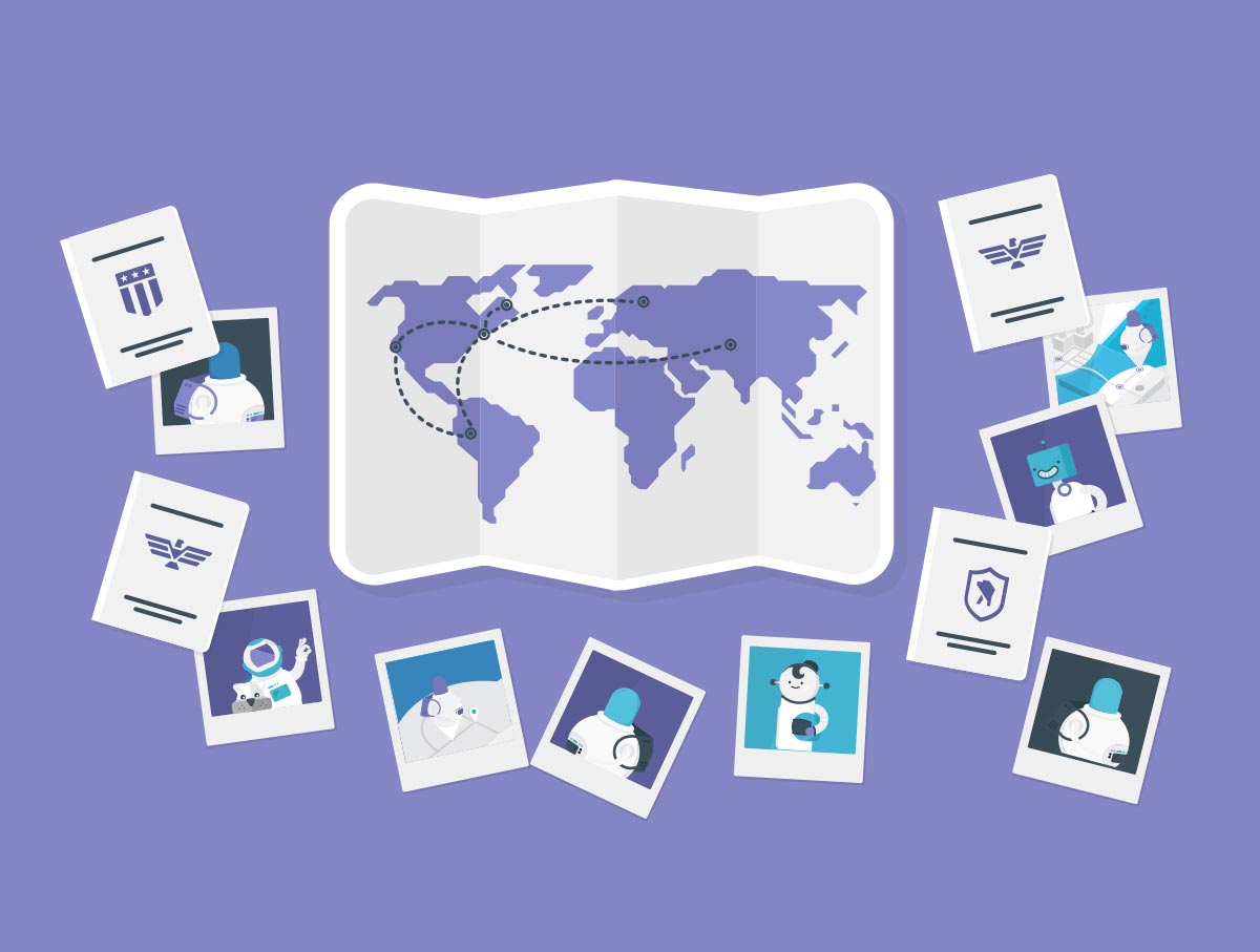
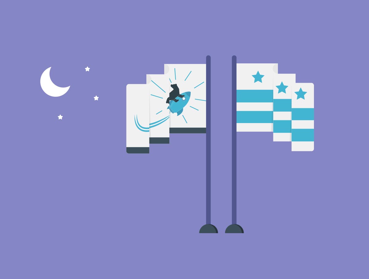
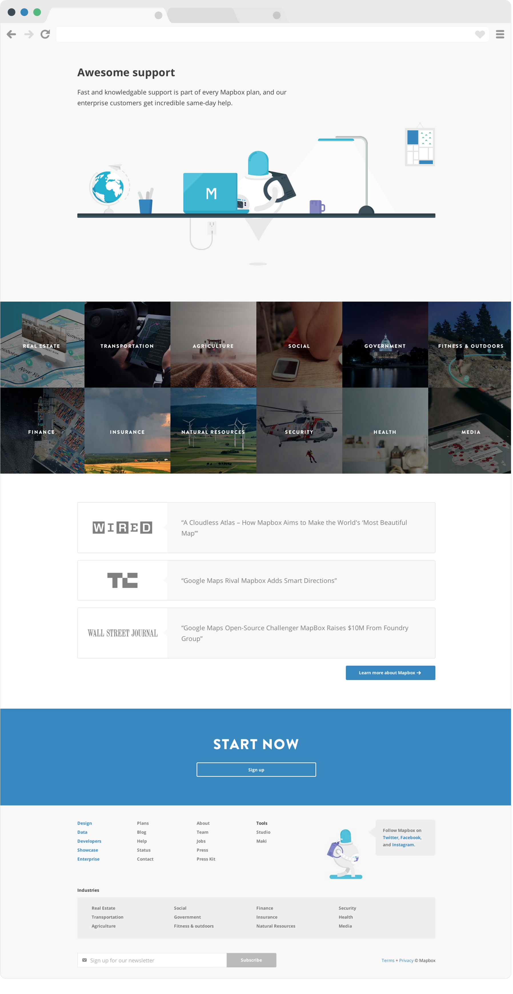
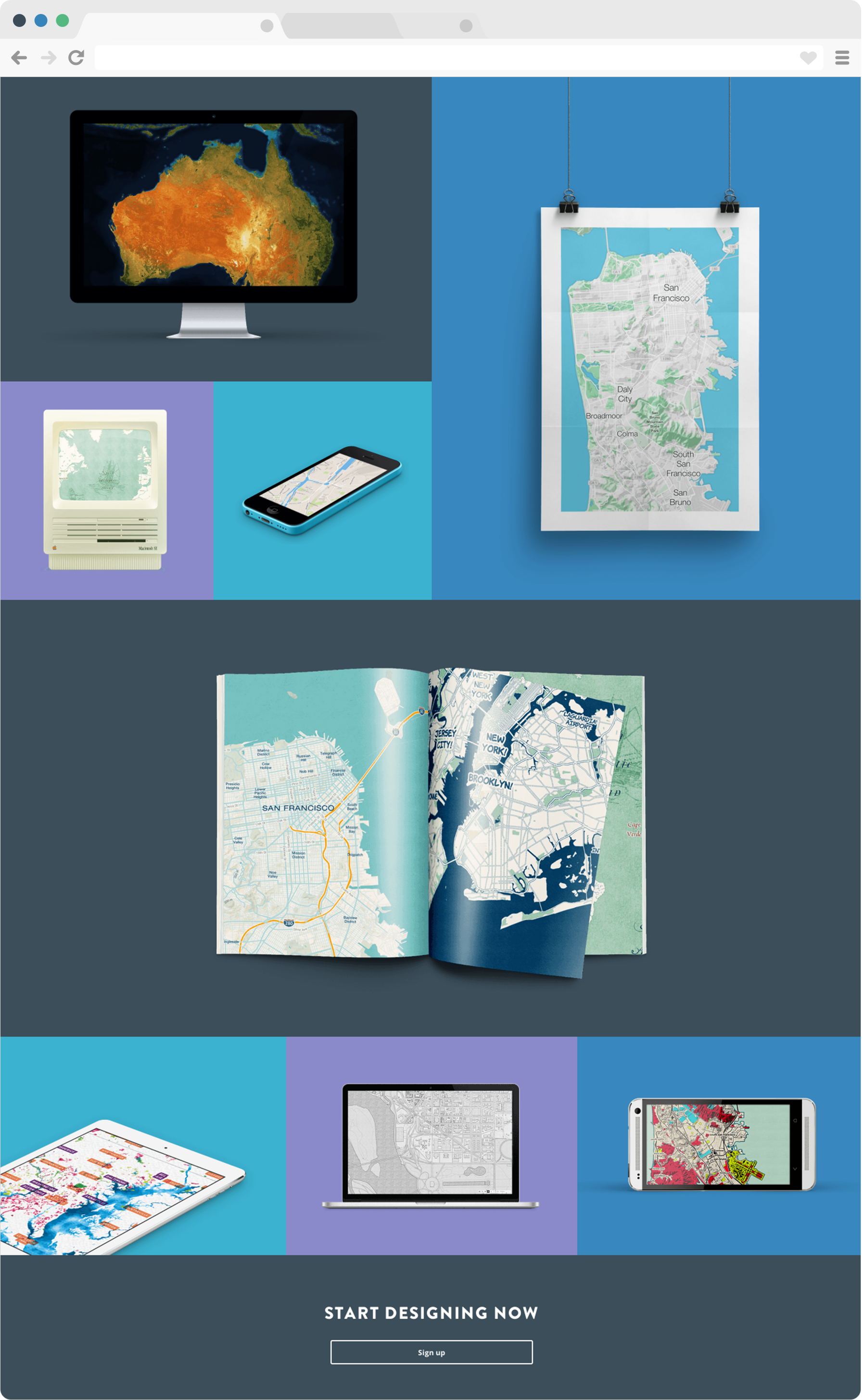
A redesign of the Mapbox website, called 'the new happier Mapbox'. I added more personality to the old brand by using bright saturated colors, bold fonts and illustrations. The goal was to create a fun, but not childish visual style that is easy to understand without being too simplistic.
- August, 2014
- UI/UX
- Frontend Development
- Illustration
- Animation
- View website



Made with and a little bit frustration